Rem Koolhaas

L8D Business Solutions is proud to present the Rem Koolhaas website. It's an independent guide to the buildings, ideas and writing of the Dutch architect and urbanist, and the practice he co-founded, OMA. The site uses bold, editorial design, strong typography and full-screen project imagery to show how Koolhaas's work has changed thinking about cities and public life. It works well on every device, so students, architects and anyone curious about architecture can move easily between projects, ideas, books and history.
Design & build of the Rem Koolhaas website
Challenges
Matching the energy of the work
Koolhaas's architecture and writing are provocative and they question accepted ideas. A quiet, conventional portfolio layout would not fit. The site needed to feel bold and confident, like the work, and still be easy to read.
Organising five decades of work
The material covers landmark buildings across several continents, the research of OMA and AMO, influential books such as Delirious New York and S,M,L,XL, plus awards, exhibitions and a long career history. All of it had to fit a structure that visitors could follow without getting lost.
Presenting it clearly as an independent project
Because the site is a guide, not an official channel, it had to be credible and well researched. It also had to say clearly that it is not affiliated with Rem Koolhaas or OMA.
Solutions
Editorial, statement-led design
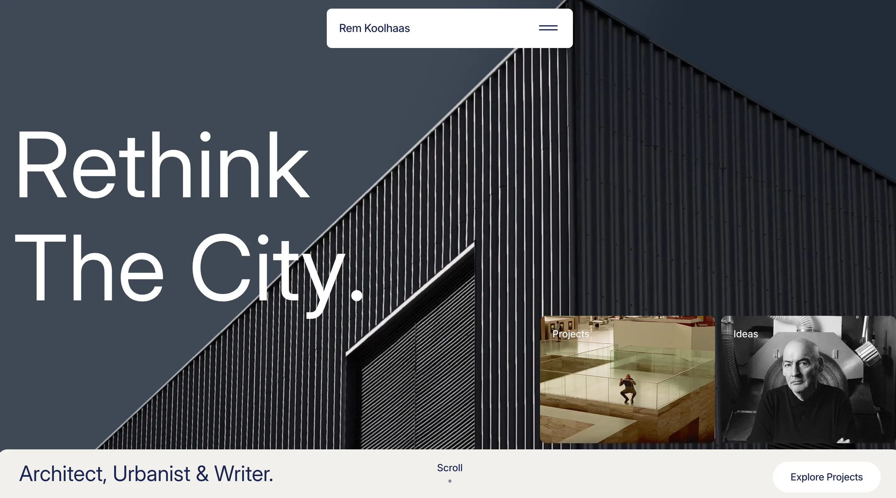
We built the homepage around a large, confident headline ("Rethink The City."), dramatic project imagery and animated text that unfolds as visitors scroll. This gives the site the punch of an architecture monograph and keeps the focus on the buildings and ideas.
A clear content structure
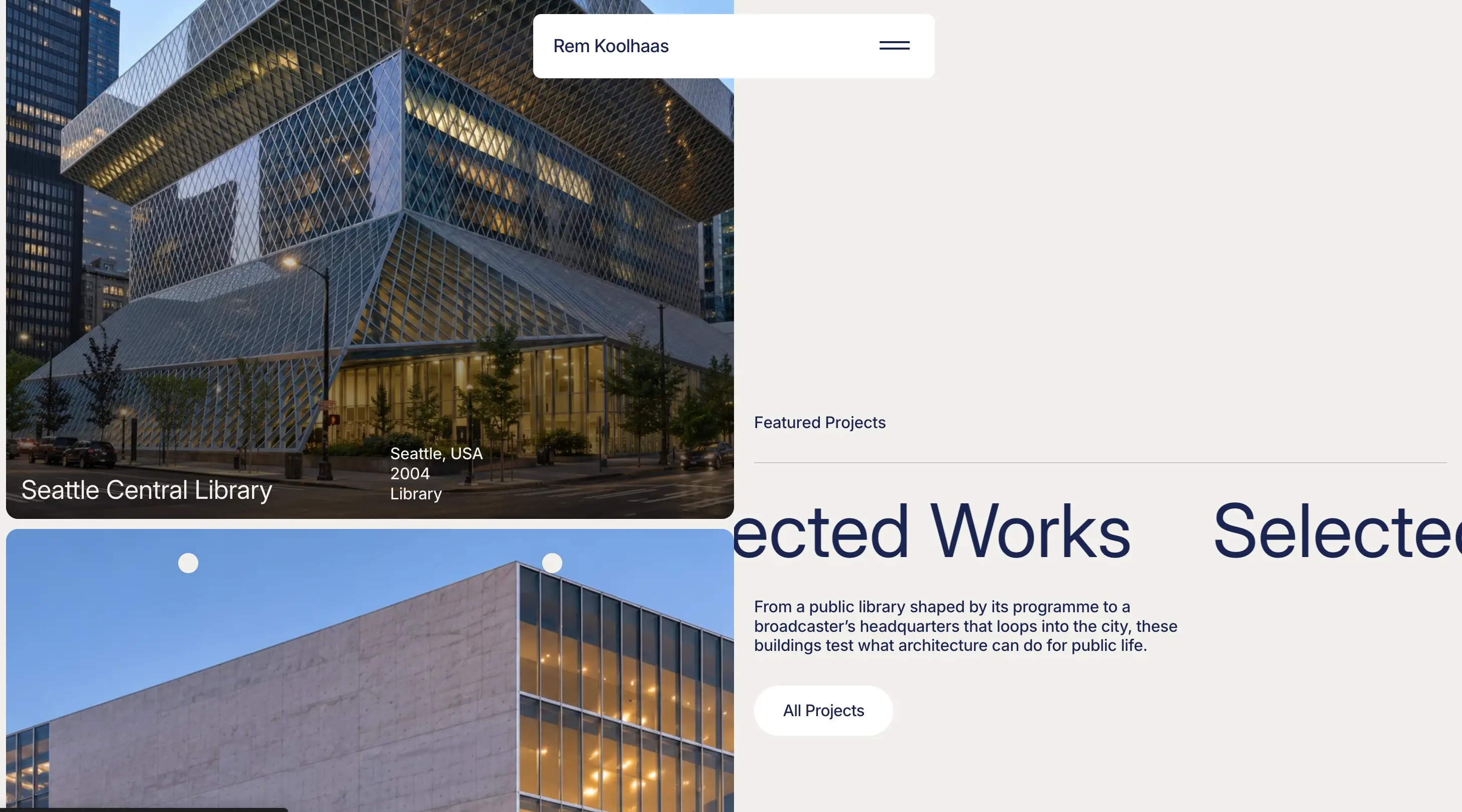
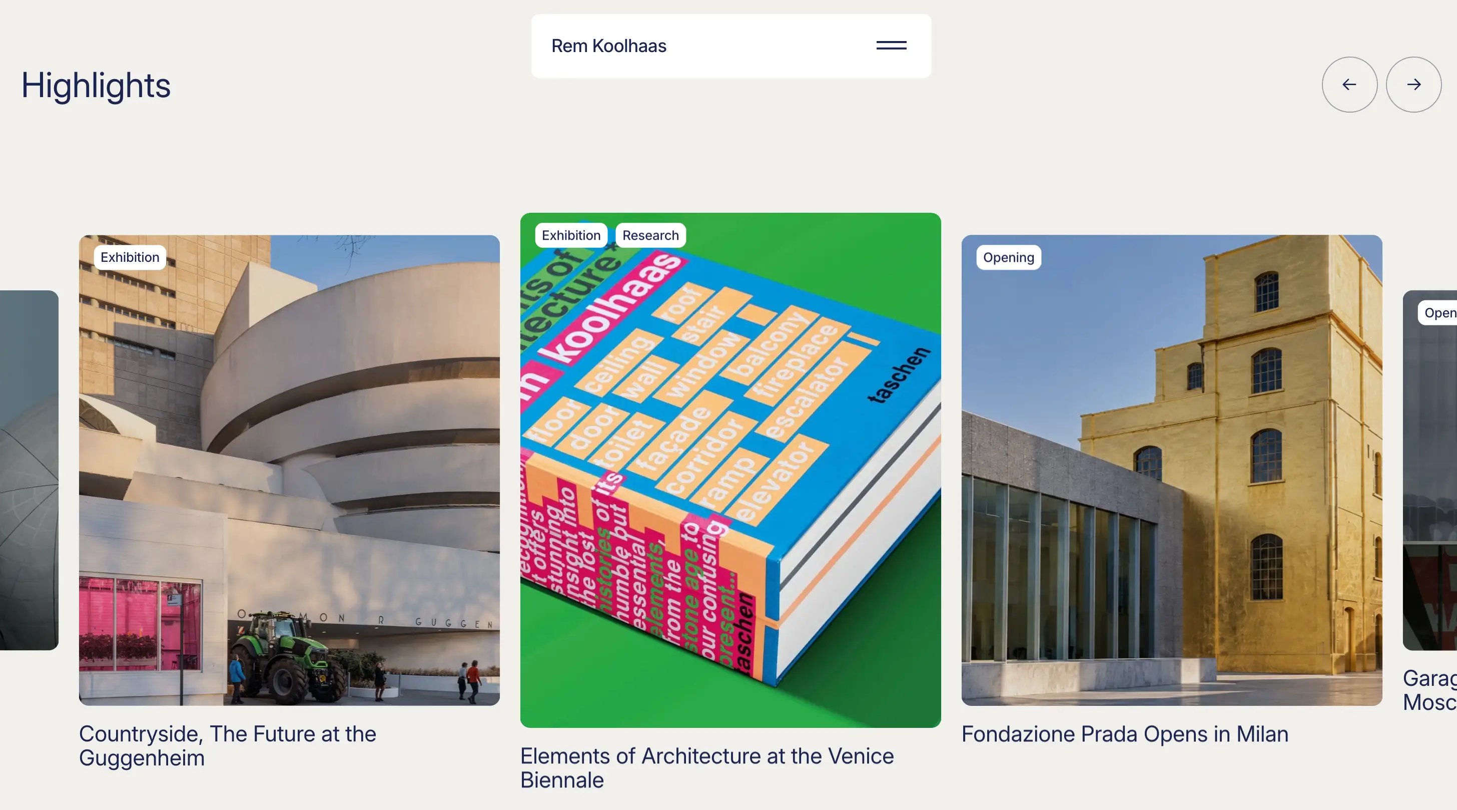
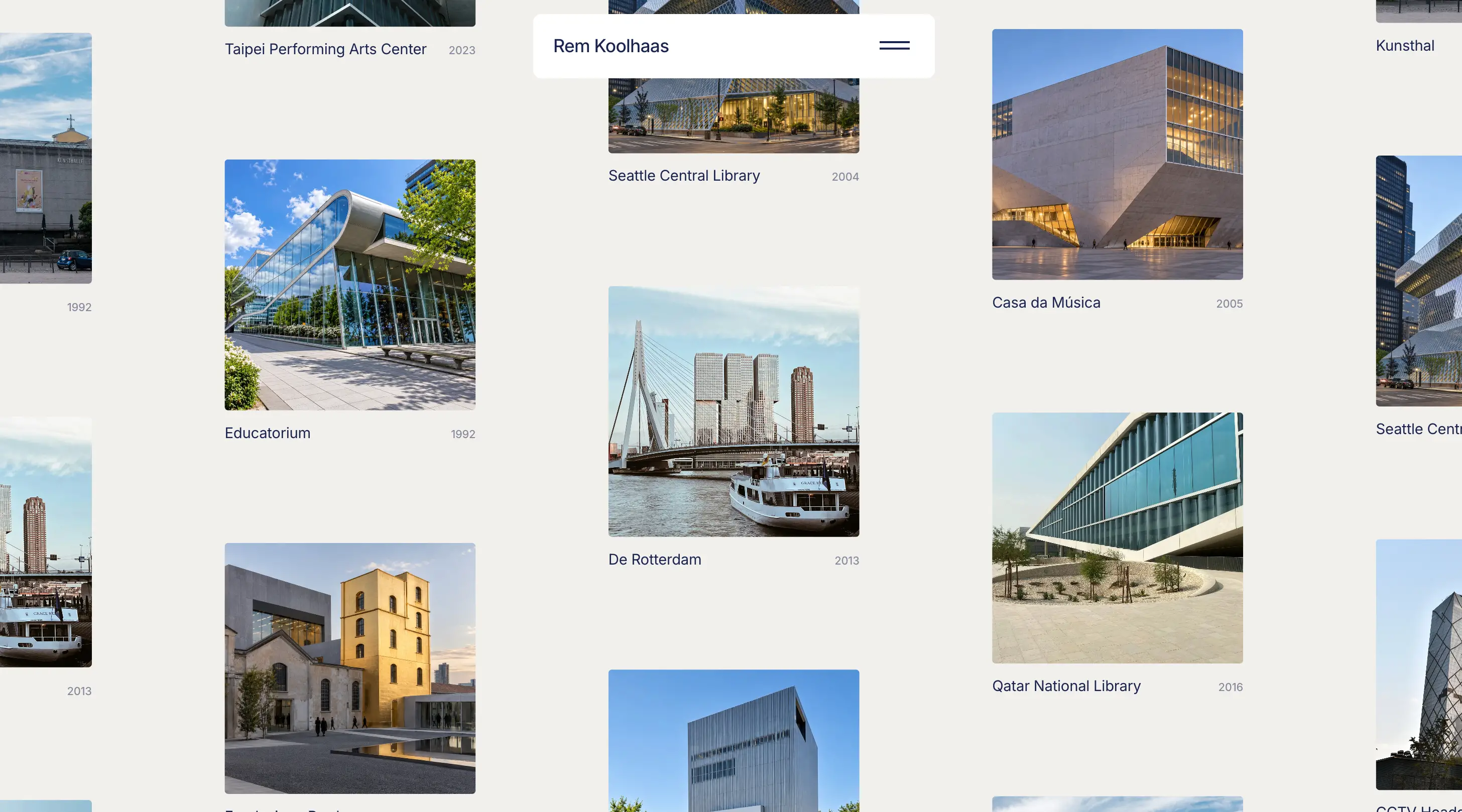
We split the content into Work (Projects, OMA & AMO, Writing), Ideas, Books and Information (Timeline, Awards, Quotes, Press). Featured projects such as the Seattle Central Library, Casa da Música, CCTV Headquarters and Fondazione Prada each show location, year and building type at a glance and link to their own pages. An interactive timeline traces key moments from 1944 to the Pritzker Prize in 2000, and a Highlights section covers major exhibitions and openings.
A fast, modern build
We built the site with Astro as a lightweight static site, with lazy-loaded imagery and clean, readable URLs, so it loads quickly even though it's full of images. A clear meta description helps search engines understand the site. A visible disclaimer in the footer and a dedicated Disclaimer page state that the site is independent.
Results
The website gives Koolhaas's work a digital home that matches its ambition: bold, structured and thought-provoking. Visitors can move from a single building to the ideas behind it, the books that shaped it and the career around it, which builds a rich picture of one of architecture's most influential figures. The lightweight build keeps the experience fast, and the modular structure makes it easy to add new projects, essays and timeline entries.
L8D Business Solutions Role
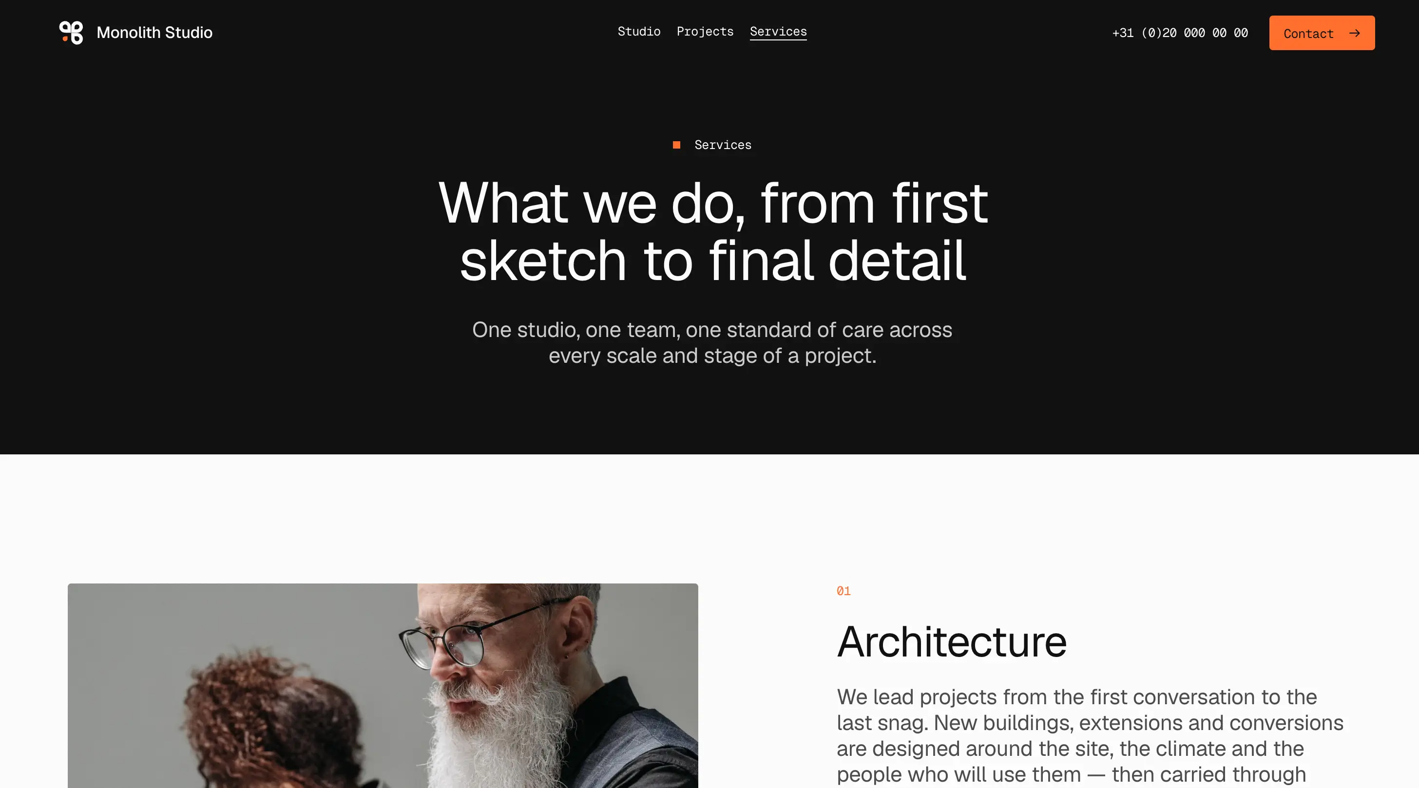
L8D Business Solutions designed and developed the Rem Koolhaas website as an independent project. We researched the architect's buildings, writing and career in depth. Then we shaped that material into a site that is engaging to explore and easy to navigate, with a design that reflects the boldness of the work it presents.L8D Business Solutions led the design and development of the new Monolith Studio website. We worked closely with the studio to understand its philosophy, its multidisciplinary practice and its long-term view of architecture. The result is a website that presents the studio's projects, services and people with the same care and restraint that define its buildings, and gives visitors a seamless, intuitive experience on every device.L8D Business Solutions played a key role in the development of the new Mies van der Rohe website. We worked closely with the client to understand the legacy, aesthetics, and vision for showcasing his architectural work. The result is a website that beautifully presents projects, publications, and events while providing a seamless, intuitive browsing experience across devices.
We are proud of the result and see it as a strong example of how thoughtful design and structure can bring a complex body of work to life online.